Feature Request for Monthly page: Stacked bar for activity types on each day
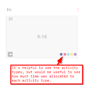
Gathering FeedbackThe calendar view currently shows us which activity types were used for each day:

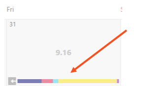
It would be even more helpful to see a representation of how much time was dedicated to each activity type. This could be achieved by replacing the individual colored squares with a stacked bar indicating the percentage of time allocated to each activity type for that day:

Now, at a glance, one could easily see how much time was spent in meetings (the yellow bar, for instance) each day this month.
Please sign in to leave a comment.

Comments
2 comments